Color Theory 101: How to Design Beautiful Spaces
Mon May 12 2025
- Interior Design
By: Amy Ellis, Furniture Design Lead
Choosing the perfect colors for your home can be overwhelming. (Seriously, who knew there were so many shades of white?)
But this process doesn’t have to be hard. Color theory is your secret weapon, and once you get the hang of it, designing spaces that feel cozy, bright, relaxing, or bold becomes way easier. Let's break down color theory to help you pick the best furniture and color scheme for your home.

What Is Color Theory?
Color theory is a framework for how colors work together. You might remember the color theory wheel from art class. That wheel is still relevant. It helps you understand which colors complement each other and which might clash.
Here are the basics:
-
Primary Colors: Red, yellow, and blue. Everything starts here.
-
Secondary Colors: Mix the primaries to get green, orange, and purple.
-
Tertiary Colors: Mix a primary and secondary for shades like blue-green or red-orange.
Interior designers lean on color theory to make rooms feel balanced. But don’t worry, you don’t need a design degree to make this work at home. Our team at Queen City Homestore can help you figure out the best color scheme for your home.
Where to Start With Color in Your Home
Take a moment to think about the vibe you want. Color impacts mood more than we realize:
-
Warm colors (like red, orange, and yellow) make a space feel cozy and energetic.
-
Cool colors (like blue, green, and purple) create a calming, serene atmosphere.
-
Neutrals (like beige, gray, and white) offer flexibility and let other colors shine.
💡 Pro tip: Start with a neutral base, like a cream sofa or a light wood dining table, then layer in color with pillows, rugs, and accent chairs.
How to Build a Color Scheme That Works
You don’t need to memorize complicated rules, just know these simple combos:
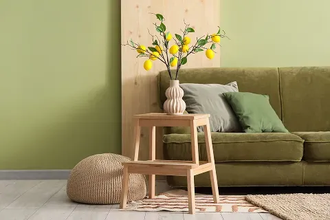
Monochromatic (One Color, Different Shades)
Want a soothing bedroom? Stick to one color but mix up the tones. A dark navy bed frame with lighter blue bedding and a pale blue accent wall? Instant zen.
Shop the look: The FD Home Furniture Lake Norman Bed in antique white makes an excellent anchor for monochromatic color schemes. Pair with subtle blues or grays to complete the look.
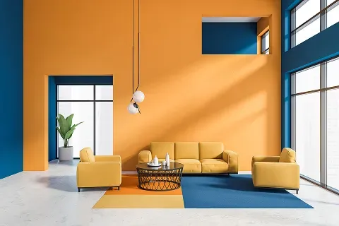
Complementary (Opposites Attract)
Complementary colors sit across from each other on the color wheel. Think blue and orange or yellow and purple. This combo creates contrast and energy.
For example, if you love a deep maroon sofa like the Hughes Furniture Benny Blaze Sofa, consider adding turquoise or mustard yellow pillows for balance.
Analogous (Next-Door Neighbors)
Pick three colors next to each other on the wheel, like yellow, yellow-green, and green, for a harmonious vibe. This works great for living rooms where you want the space to flow.
Try this: Style a Franklin Furniture Protege Loveseat (neutral yet inviting) with blue or blue-violet accent pillows and natural wood tables for that earthy, pulled-together feel.
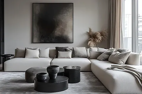
Home Color Trends to Know
Color trends are leaning toward softer, nature-inspired hues lately—think sage greens, muted terracottas, and creamy off-whites. Earthy tones help create peaceful retreats, especially in spaces like the bedroom or reading nook.
The FD Home Furniture Pembroke Bedroom Set pairs a soft wood finish with matte black accents. It's neutral, but far from boring, making it perfect for layering on trend-forward, calming colors.
Another trend gaining momentum is moody jewel tones. Deep emeralds, rich plums, and sapphire blues are making a big comeback, adding drama and depth to living spaces. These colors work beautifully as accent walls, statement chairs, or cozy throws, especially when paired with neutral foundational pieces.
Color Theory Secret Ingredient: Texture + Color
Color isn't just about paint or pillows; texture matters too. Matte, glossy, soft, or rough finishes all impact how colors are perceived.
For example, the sleek finish of the Liberty Furniture Stephen 5 Piece Dining Room Package pairs well with its soft linen dining chairs, creating a cozy yet elegant dining space.
Mixing materials (wood, fabric, metal) with your color palette keeps things interesting and adds depth to the room.
Choose a Color Palette With Help From Queen City
Color theory gives you a solid foundation, but at the end of the day, your home should feel like you. Don’t be afraid to experiment. Start small with accents, or go big with statement furniture. Whatever makes you happy!
Need a little extra help pulling it all together? Contact us or visit one of our local Queen City locations across the Carolinas to shop our selection of living room furniture, dining room furniture, and bedroom furniture to upgrade your home’s style today!
Related Readings:
FAQ: Questions About Color Theory and Home Design
1. How do interior designers use color theory?
Interior designers use color theory to create balanced, inviting spaces. They combine colors thoughtfully to set the mood and make each room feel cohesive.
2. Where do I start when picking a color scheme for my home?
Think about how you want the space to feel. Calm? Energetic? Neutral? Start with a neutral base and layer in colors that match your desired mood.
3. How do complementary colors work in home design?
Complementary colors are opposite each other on the color wheel. Used together, they create contrast and make rooms pop (think navy + orange or green + pink).
4. Can I use color theory without repainting my walls?
Absolutely. Try adding colorful throw pillows, rugs, lamps, or artwork to introduce color without major commitments.
5. Why is color combination important in interior design?
The right color combinations can make your space feel harmonious and inviting, while poor combinations may feel chaotic or dull.
Related Articles